How to setup a layout with CSS Grid

What you will learn
- What are the main topics covered in the blog post about CSS Grid?
- The main topics covered include how to create a CSS Grid container, how to use CSS Grid template areas, and how to use CSS media queries with CSS Grid template areas for responsive web layout.
- How do you create a CSS Grid container?
- To create a CSS Grid container, set the display property of a CSS selector (like CSS classes) on the root layout element to 'grid'.
- What is the 'grid-area' property used for in CSS Grid?
- The 'grid-area' property is used to name a CSS class as a CSS Grid area, allowing it to be referenced for responsive positioning in the parent grid layout.
- How does the 'grid-template-areas' property contribute to CSS Grid layout?
- The 'grid-template-areas' property allows for a declarative way to describe the desired layout, indicating where grid areas should be placed within the grid.
- What technique does the blog post suggest for building responsive layouts with CSS Grid?
- The blog post suggests defining the smallest layout first and then using CSS media queries to re-define the layout for larger screens, taking advantage of the additional space to expand content horizontally.
Table of Contents
- Introduction
- How to create a CSS Grid container
- How to use CSS Grid template areas
- How to use CSS media queries with CSS Grid template areas
- Conclusion
Introduction
In this blog post, we are going to explain how to setup a simple, responsive web layout with CSS Grid and minimal layout CSS.
The topics we are going over include how to create a CSS Grid container, how to use CSS Grid template areas, and how to use CSS media queries with CSS Grid template areas - for building the responsiveness we are looking for, both simply and declaratively. This is the CodePen with the finished code we are going to be building in this tutorial blog post. Here’s what it will look like:

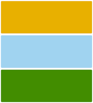
and on smaller screens:

How to create a CSS Grid container
First up, we need to create a CSS Grid container. This is pretty easy to do, just set the display property of a CSS selector (like CSS classes) on our root element of our layout, like so:
.home-content {
  display: grid;
}
At this point, and to expand our our layout to fill the parent (in this case, the body of the HTML5 document), our home-content class (our root layout CSS class) and our body CSS selector should look like this:
body {
  box-sizing: border-box;
  margin: 0;
  padding: 0;
  height: 100vh;
  width: 100vw;
}

.home-content {
  display: grid;
  width: inherit;
  height: inherit;
}
The HTML we are working with for this tutorial is entirely just this:
<div class="home-content">
  <div class="line-1"></div>
  <div class="bar-0"></div>
  <div class="line-0"></div>
</div>
Pro tip: the body element is the root element of the content of the document (not discussing the head element here), so if we set it to have 0 margin and 0 padding (margin is outside of an element’s border, padding is inside an element’s border by the way), with box-sizing (for good practice) set to border-box, we can set the body to have a width of 100vw and a height to 100vh and we will completely, perfectly fill the viewport without any awkward scroll. And, if we set the home-content class to inherit the width and height of it’s parent, our root layout element will completely fill the viewport (the “stuff” you see in the browser outside of the browser’s UI). See the CodePen to play around with it!
With our root layout element CSS set, we can move on to how we can describe our layout with CSS Grid template areas.
How to use CSS Grid template areas
First, we’ll share the code, then break it down:
.bar-0 {
  grid-area: bar-0;
  background: green;
  /* just so this grid child doesn't shrink too much*/
  min-width: 400px;
}

.line-0 {
  grid-area: line-0;
  background: orange;
}

.line-1 {
  grid-area: line-1;
  background: skyblue;
}

.home-content {
  display: grid;
  width: inherit;
  height: inherit;
  grid-template-columns: 3fr 1fr;
  grid-template-rows: repeat(10, 1fr);
  grid-template-areas:
    "line-0 bar-0"
    "line-0 bar-0"
    "line-0 bar-0"
    "line-0 bar-0"
    "line-0 bar-0"
    "line-1 bar-0"
    "line-1 bar-0"
    "line-1 ."
    "line-1 ."
    "line-1 .";
}

/* added for minimal polish of this codepen. Not important for the layout itself */
.home-content > div {
  margin: 0.5em;
  border-radius: 8px;
}
Let’s explain what we are doing with the line-0, line-1, and bar-0 CSS classes. The CSS Grid-related property we’ve added is called grid-area. What we are doing specifically here with grid-area is to name the particular CSS class as a CSS Grid area to let us then reference (for responsive positioning) in our parent grid (the home-content class). We can accomplish this referencing through the use of the grid-template-areas CSS grid property in our home-content CSS class.
The grid-template-areas property is what let’s us “declaratively” describe what we want our layout to look like. Before we can get our CSS Grid to layout as we intend, we have to tell CSS Grid how to create the columns and rows of our grid. We can use grid-template-columns to create our grid’s columns, and grid-template-rows to create our grid’s rows, using generally either exact pixel units or a newer, more flexible unit called “fr”, which represents a fraction of the leftover space in the grid container. So, in our home-content class below:
.home-content {
  display: grid;
  /* ... */
  grid-template-columns: 3fr 1fr;
  grid-template-rows: repeat(10, 1fr);
  /* ... */
}
What we are saying for our columns with the grid-template-columns property, is that we want our first column (the 3fr number) to be three times larger than our second column (the 1fr number), and we want both columns to expand to the full width of our grid container (“proportionally” expand on a 3-to-1 basis).
For our rows with the grid-template-rows, we state that we want ten rows each exactly equal to 1fr. The repeat function is a nice convenience over typing out 1fr ten times manually. The reason we are using a high number of rows here is to create the layout that’s impossible with Flexbox without special, specific child class CSS or creating additional elements: in a single CSS Grid property, we can create an “uneven” yet responsive element (our bar-0 div). Our bar-0 grid area “overlaps” an imaginary horizontal cross-section between the line-0 and line-1 divs. We can now define our entire grid layout with the grid-template-areas CSS property like below:
.home-content {
  display: grid;
  width: inherit;
  height: inherit;
  grid-template-columns: 3fr 1fr;
  grid-template-rows: repeat(10, 1fr);
  grid-template-areas:
    "line-0 bar-0"
    "line-0 bar-0"
    "line-0 bar-0"
    "line-0 bar-0"
    "line-0 bar-0"
    "line-1 bar-0"
    "line-1 bar-0"
    "line-1 ."
    "line-1 ."
    "line-1 .";
}
As an aside, something to mention here about the dot, ”.” inside our grid-template-areas property. In order for our grid-template-areas to match up according to our grid-template-rows and grid-template-columns specifications, we need to have exactly 2 rows of 10 columns fully defined, but we want the bar-0 to “exactly overhang” by “3” fr units. So we use the dot, ”.” to designate “hard stops” between cells. The net effect is to keep our grid sized as expected as well as for CSS Grid to know how to “responsively” handle the empty space of the last three cells at the bottom right of our grid. Try removing the dots on the CodePen; you’ll see that the layout breaks.
This layout above looks pretty good on larger screens, but what about smaller screens, where multiple columns of content generally look bad? That’s where we can use CSS media queries with CSS Grid.
How to use CSS media queries with CSS Grid template areas
The general best practice for building responsive layouts is to define your smallest layout first (for the smallest screen sizes you will support), then use CSS media queries to re-define your major layout-controlling containers to (typically) expand to fill the additional space offered by larger screens. This often means things like allowing content to take up space horizontally, as well as vertically, rather than focusing on a vertically-oriented content for smaller screens like mobile phones.
So, for our grid-based layout, all we are going to do is define our smallest layout outside of any CSS media query first, and then define our multi-column layout for larger screens inside a single CSS media query (with a minimum screen width just set to 900px):
/* vertical-oriented layout suitable for smaller screens */
.home-content {
  display: grid;
  width: inherit;
  height: inherit;
  grid-template-columns: 1fr;
  grid-template-rows: repeat(3, 1fr);
  grid-template-areas:
    "line-0"
    "line-1"
    "bar-0";
}

/* taking advantage of larger screen real estate to add another column */
@media screen and (min-width: 900px) {
  .home-content {
    display: grid;
    width: inherit;
    height: inherit;
    grid-template-columns: 3fr 1fr;
    grid-template-rows: repeat(10, 1fr);
    grid-template-areas:
      "line-0 bar-0"
      "line-0 bar-0"
      "line-0 bar-0"
      "line-0 bar-0"
      "line-0 bar-0"
      "line-1 bar-0"
      "line-1 bar-0"
      "line-1 ."
      "line-1 ."
      "line-1 .";
  }
}
This works because of how cascading works in CSS. In our CSS, once the user’s screen is at least 900px wide, our CSS media query will become “activated” and since the home-content rule inside the CSS media query, defined after our mobile layout home-content CSS class definition, the later CSS class definition (in our media query) will take precedence and override our mobile-oriented layout for targeting larger screens.
Conclusion
In this blog post we’ve explained how to setup a simple web layout with CSS Grid using grid template areas. The complete layout can be found in the CodePen we made for this blog post. Hope you found it helpful! Feel free to share and connect with me on Twitter!